Unboxing
 |
| AWWW YEAH!! HAPPY DANCE. |
Today has been a very good day. Today, the start of my Sedition Wars Kickstarter items arrived (better late than never!).
I also had an awesome steak for dinner, but that's beside the point. This has taken a bit to get to me, and I have been waiting with baited breath ever since the kickstarter ended. Alas none of the additions have made their way out yet, so I must make due without all of the awesome extras I paid for (Exo-suit, Carapace Armour Kara, The FIREFLY CREW, Riddick, that dude from Dead space, Ripley & Newt & Vasquez, That chick from Battlestar Galactica, et all~). Thus I shall show you all the magic that is the main boxed set along with a few of the initial shipment extras I recieved and let you all see what an impressive product this is.
Note: This is going to be a long post.
 |
| Droooooool. |
AAAAAAnnyways, Join me now as I unbox this awesome new game!
Warning! PICTURE and WORD HEAVY!!
First thing's first:
The Box. It's s little on the awkward side being a perfect square and not a rectangle like 99% of the games out there. This, naturally threw, me for a loop, but it is what it is, and it just means it'll be easier to find it when I go looking on the shelf for it! The printing on the sides and the back really speak for themselves (no pun intended) and present the game very well. The box itself is a little on the thin side (though by no means
weak) and I worry that it will tear or fall apart if abused. C'est la vie.
You'll notice in the above pic that the cover of the game is covered over by the LE signed print, my extra bag of Samaritans and Infected, the sexy sexy LE dice, the Samaritans patch and the cards for the units. This is because
I'm a dick and am showing off I got excited and took pics of everything and then was too lazy to go back and take an extra picture of the cover. Sorry.
no I'm not.
Secondly, the
Instruction Manual. It's very well laid out, magazine format, and is printed on very nice, crisp paper. Very bright and linear as well. I'm not going to show the interior as I'll do that when I review the game itself in the future. Suffice to say, I was impressed by the production quality and found it to be ABOVE AND BEYOND what GW generally puts into their "Splash" releases such as Space Hulk and Dread Fleet (Which is high quality indeed!), which, in itself, is very
very impressive. Good job CMON/Studio McVey!
These are the
special edition Dice from the Kick starter. I'm going to play fan boy here for a second as, strangely, this is my favourite part of the boxed set (which, alas, 99% of you won't get). I am just in love with the colours and quality of the dice, with each faction getting a separate colour (Teal for the strain, and Blue for the Samaritans), along with different fonts/pips on the different factions dice as well. I love these dice. They have a very very nice heft to them (aren't too light, nor too heavy), roll nicely, have highly visible numberings and symbols (located on the 6's as they should be!) and are generally superior dice all around. I'm a bit of a Dice-o-phile and am known amongst certain groups to go on at length as to what makes a good dice and why. I have very definitive ideas on the subject (high visibility from across a table, heft, none of those stupid "spotty/camo" style dice!) and I will say that these dice won me over onto the set more than anything else. See!
Told you I'm strange...
The
Actual dice in the set are, alas, not as lovely as these dice, being solid, opaque, black dice with white pips, though
they DO share the same weight and size, and are therefor quite nice dice as well. A picture of them can be found below once I get into the box itself.
These are the
Unit cards for the various units
you don't say.... included in the game. They are double sides, as seen above, and each side features a full colour picture of the unit it covers as well as it's relevant stats and abilities. Quick reference is
never a bad thing and these cards will, no doubt, come in very handy during play. The text is clear and concise, the colour choices are effective as they showcase the text without unnecessary clutter and shading. The card stock used is a teensy-bit on the thin side, so I'm not sure how they'll handle a lot of wear and abuse, but they seem sturdy enough.
The
Special edition Resin Lt. Kara is quit a lovely figure. The resin used is very sturdy and I found no bubbles of imperfections on the model itself. Finecast this ain't! The model, like all others in the set, includes a hard-plastic textured base made up to look like the interior of Alabaster station. All in all, a fine product indeed.
The
Textured hard plastic bases for the minatures are, as stated above, surprisingly highly detailed and are modeled to look like the interior of Alabaster station. Enough bases are provided for all miniatures included in the set. The textures are crisp and clean and rather sci-fi-esque and really look pretty awesome. These bases would not go remiss on Infinity models (
hint hint) and would really look the part. An interesting aside about these bases is the double pin located underneath. These are there so as to allow the players to add the included infection level "tokens" directly to the model itself so as to avoid confusion during gameplay. It's a pretty inventive concept and I highly approve.
Note: The infection tokens are the RED and BLUE plastic pieces shown in the "inside box" view shown 5 pictures down.
The
Models themselves are made of a sturdy grey plastic (similar to GW's plastics, though slightly tougher and more rigid) and seem to be pretty straight forward to build. I didn't get too into the models as I plan on giving them their own review shortly. Rest assured you will all be kept up to date with my progress as to these figures as I paint them up and playtest the game itself.
STAY TUNED!
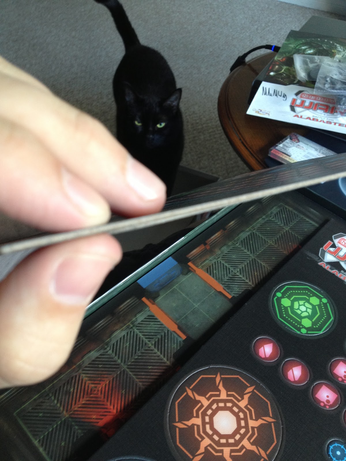
The
Cardstock tokens and Board pieces are astounding. The cardstock itself is surprisingly thick (about 3mm) and, as one can see, the colours are
very vibrant and clean. Even my cat (that's Delilah, Luba was, alas, camera shy) approves of the pieces as she
immediately made a home in the box and started to chew on the cardstock. Apparently it is tastey.
And finally, the
Interior of the box is rather artsy (a heavy card-stock insert composed of two "shelves" (one on each side) and a "valley", all covered in fine art (a copy of the cover art). The spacing is quit generous and is spacious enough to allow for ALL of the components of the game, including the extras of the miniatures I received (double the regular amount of mini's), with space to spare. Everything fits in nice and tidy without bulges or over-stuffing the box, which, quit frankly, is surprising considering the sheer amount of
stuff one gets.
Overall, I am truly impressed with this product and (so far) recommend it whole-heartedly. I give it a firm
9/10 (lost half a point each for the box being thin/flimsy and the cards being less than sturdy). Job well done CMON/Studio McVey!
I hope this review gives you pause for thought and helps you, the audience out if you had any questions. keep an eye out for more reviews of this product (the game itself and the models!) as I delve deeper into the mysteries of Alabaster Station!
Until next time,
Watch out for Nano-clouds.... they could turn you into a zombie!
Bean out~


Good to know they made it there in decent nick. I still haven't opened my own box... lol...
ReplyDelete